Buurst Branding and Design System
Buurst Branding and Design System
We’re a Data Performance Company
Buurst is thinking about our customers’ data differently, so they can continue to grow and move their business forward. We know our customers need to move fast, and so does their data. Buurst’s cost-effective data migration and performance management solution opens up new opportunities and capabilities that continually prepare organizations for success.
We use photography, illustrations, and iconography to communicate how we make cloud decisions work for our customers – through data performance, data migration, data cost-management, data availability, and data control and security.
SoftNAS is written as Buurst’s SoftNAS on the first mention, and SoftNAS on following mentions.
Our brand is a living entity and is constantly evolving. Just like Buurst, it never stands still and is always reaching for greater simplicity and comprehension with a modern flair.
As the brand continues to evolve, you may see some older styles mixed with newer iterations and ideas.
Treat the Buurst brand with respect and it will work hard for you.
Logo System
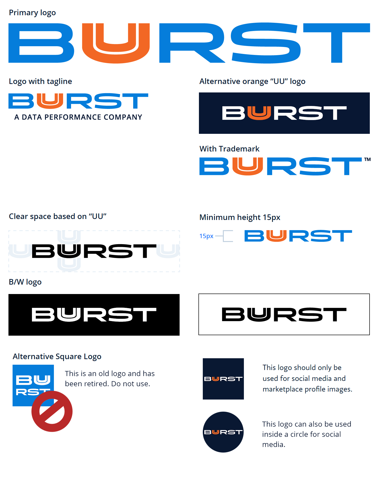
The Buurst logo is a representation of the energy and trust our brand provides. The primary logo should always be the default logo. The logo was designed in a way to scale up and down so that the “UU” treatment is legible. The lowest recommended logo height is 15px. Legibility should always be considered when placing the logo. To the right are acceptable alternative uses and guidance on clear space.
Logo Sytem RESTRICTIONS
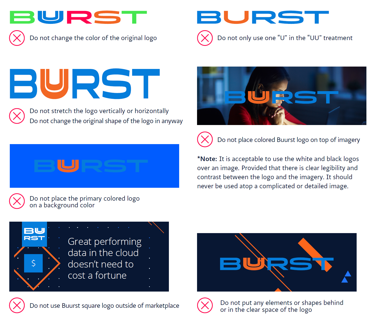
The primary Buurst logo should always be honored in its original form. It should never be stretched, skewed, twisted or manipulated in any way. It is the foundational element that anchors Buurst within assets. To the right are a couple of examples of what NOT to do with the Buurst logo system.
We NEVER use the “UU” by itself.
Secondary Mark – SoftNAS
Buurst is our logo. The secondary product mark is for our product: SoftNAS. It builds on the energy and trust of the Buurst Logo.
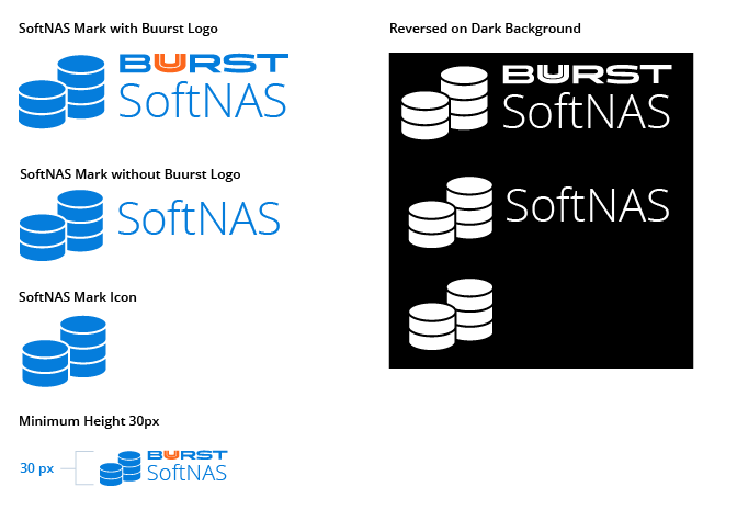
The SoftNAS mark has been designed to utilize our primary blue. Do not use any other colors except for the reversed white versions.
The lowest recommended height is 30px. Legibility should always be considered when placing the mark.
The mark has three variations so that it is easy to use in diagrams and charts as well as by itself.
When in doubt of usage guidelines, fall back on the dos and don’ts of the Buurst logo.
Secondary Mark – Fuusion
Buurst is our logo. The secondary product mark is for our product: Fuusion. It builds on the energy and trust of the Buurst Logo.
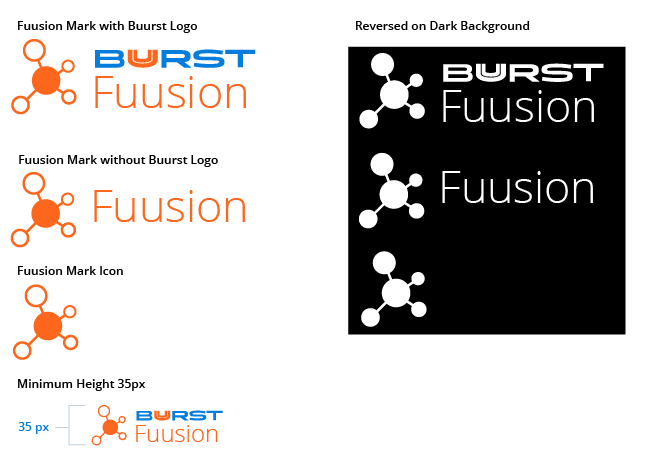
The Fuusion mark has been designed to utilize our primary orange. Do not use any other colors except for the reversed white versions.
The lowest recommended height is 35px. Legibility should always be considered when placing the mark.
The mark has three variations so that it is easy to use in diagrams and charts as well as by itself.
When in doubt of usage guidelines, fall back on the dos and don’ts of the Buurst logo.
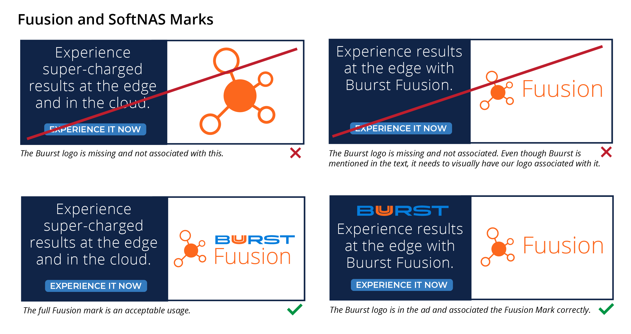
The version of the Secondary marks without the Buurst logo should only be used in decks, ads, or situations where the buurst logo is also on the page AND it is clear that either Fuusion or SoftNAS are being referenced.
Color Palette
Primary
The primary color palette, a core pillar to Buurst branding, should be strictly adhered to. Buurst Blue and Buurst Orange can be used individually as design elements, but shouldn’t be considered when layering (using either orange over blue or blue over orange). Use secondary colors to layer.
Buurst Blue
HEX #057DDC
RGB 5 | 125 | 220
CMYK 80 | 48 | 0 | 0
PMS 2173 C
Buurst Orange
HEX #F26724
RGB 242 | 103 | 36
CMYK 0 | 74 | 98 | 0
PMS 165 C
Black
White
Secondary
The secondary color palette adds a depth of blues, oranges, and grays which can be used in unison with the primaries. This palette can be used within graphical elements, illustrations, and diagrams/tables, but should be used sparingly as hero elements.
Turquoise Blue
HEX #42D6FF
RGB 66 | 214 | 255
CMYK 56 | 0 | 1 | 0
Cerulean Blue
HEX #1BA4C9
RGB 27 | 164 | 201
CMYK 75 | 17 | 13 | 0
Aegean Blue
HEX #2E5C80
RGB 46 | 92 | 128
CMYK 88 | 62 | 31 | 11
Midnight Blue
HEX #0D2447
RGB 13 | 36 | 11
CMYK 100 | 88 | 42 | 44
Sherbert Orange
HEX #D6B37B
RGB 214 | 179 | 123
CMYK 17 | 28 | 58 | 0
Carrot Orange
HEX #E78F4B
RGB 231 | 143 | 75
CMYK 7 | 51 | 80 | 0
Fire Orange
HEX #AD3600
RGB 173 | 54 | 0
CMYK 22 | 89 | 100 | 15
Mocha Brown
HEX #4B0000
RGB 75 | 0 | 0
CMYK 44 | 88 | 80 | 68
Smoke Gray
HEX #F2F2F2
RGB 242 | 242 | 242
CMYK 4 | 2 | 2 | 0
Sky Gray
HEX #D1E0ED
RGB 209 | 224 | 237
CMYK 16 | 6 | 3 | 0
Raven Gray
HEX #707880
RGB 112 | 120 | 128
CMYK 59 | 46 | 40 | 9
Shadow Gray
HEX #2E333B
RGB 46 | 51 | 59
CMYK 76 | 67 | 56 | 54
Accent Colors
The alternative color palette provides depth of color to the primary color palette. These colors should be utilized sparingly within illustrations and icons to represent stages.
Lime Green
HEX #45E54F
RGB 69 | 229 | 79
CMYK 62 | 0 | 97 | 0
Imperial Red
HEX #FF004F
RGB 255 | 0 | 79
CMYK 0| 99 | 59 | 0
Mango Yellow
HEX #FFCF31
RGB 255 | 207 | 49
CMYK 0| 18 | 90 | 0
Medium Gray
HEX #C7C2C0
RGB 199 | 194 | 192
CMYK 0| 3 | 3 | 25
Gradients
Gradients can be used in tandem with the primary color palette. They shouldn’t be overused and never used alone. The primary gradient is shown below. Other gradients are acceptable in very rare cases.
Primary Blue → Turquoise Blue
Typography
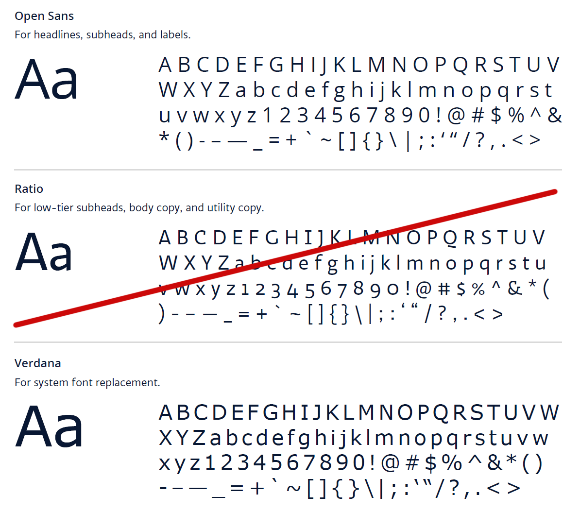
Buurst’s type system use Open Sans to offer readability and a futuristic personality to the brand. Open Sans provides a neutral, yet friendly appearance to letterforms.
We use secondary fonts such as Verdana, Calibri, Arial, or Helvetica when the primary font isn’t available.
You can download Open Sans here:
If you don’t know how to install a font, do a search on the web and you will be able to find instructions for your system.
Website:
The website uses Open Sans and a special secondary font called Monserrat. This font is built into our web template and shouldn’t be used for print or outside the company website as it has not been purchased and installed companywide.
Photography
Photography should be representative of our target audience…focused, driven, diverse, and technologically equipped. Photography should be polished, clean, and balanced. Imagery with people should represent a focused individual or team. When possible, use images of people who are NOT looking directly at the camera.
To add depth to the selection of images, professional shots of architecture, cityscapes, and computer generated technology backgrounds can be used as elements representing a sense of scale, intricacy, and scope.
Illustration and Graphic Elements
Illustration allows us to differentiate from competitors and connect with our audience through visual storytelling that is powerful, modern, and balanced. Our illustrations are created with purpose, conveying technical concepts and incorporating brand elements like color and iconography. We do NOT use hand-drawn styles of illustration.
We gravitate towards a lighter and brighter selection of graphics, but you will still see the darker style used on many occasions when contrast is necessary.
Tips:
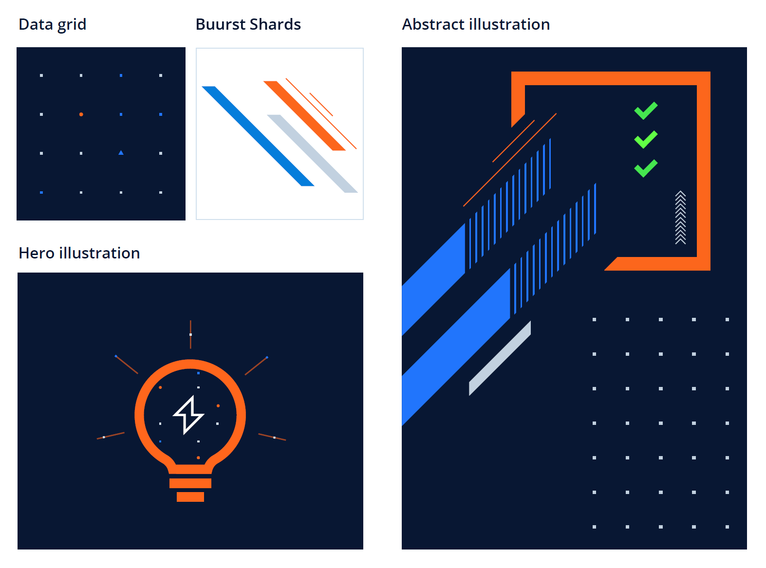
The data grid is the base of many our illustrations. It can be used on white and dark backgrounds. It is made up of perfectly aligned squares that have circle and triangular highlights.
Buurst Shards form the foundation of the Buurst brand ideal. They are crisp, clean, modern, and convey a sense of movement. They can be used in solid colors, gradients, with varying levels of transparency, and as the base of more complex illustrations. Just like Buurst AND our customers, life isn’t a single object, but a complex collection of varied and interweaving parts – just like the shards.
Hero illustrations are an offshoot of our iconography and should use the same aesthetic sense.
Light Backgrounds are preferred, but you can occasionally mix it up with secondary dark backgrounds for special occasions.
Iconography
Our iconography is clean, bold and stark. The iconography should provide a balance against the other elements within the brand. Black and white can be used on iconography when needed. Orange can be used as an accent.
Iconography 2.0 uses our Midnight Blue as it’s primary color with Buurst Orange as an accent. A fully reversed icon for dark background used white only.
As our products continues to mature and our customers grow, we are searching for images that are more specific, visually appealing, and better illustrate the heart of a concept.
Diagrams
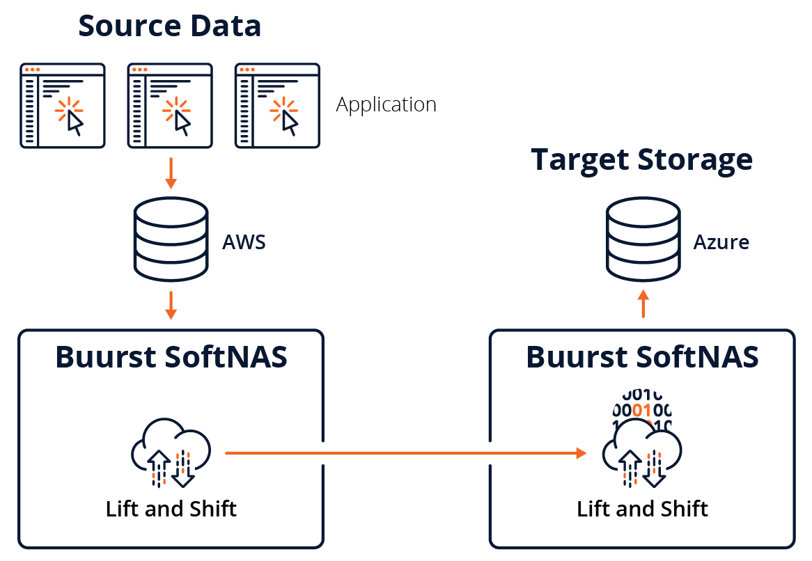
Our diagrams clearly communicate their intended technical purpose. We try to limited the colors to:
#2175FC
#0D2447
#D1E0ED
#F26724
Black and white or one-color are acceptable within diagrams when needed.
Tints can be used for contrast and to showcase and idea when used sparingly.
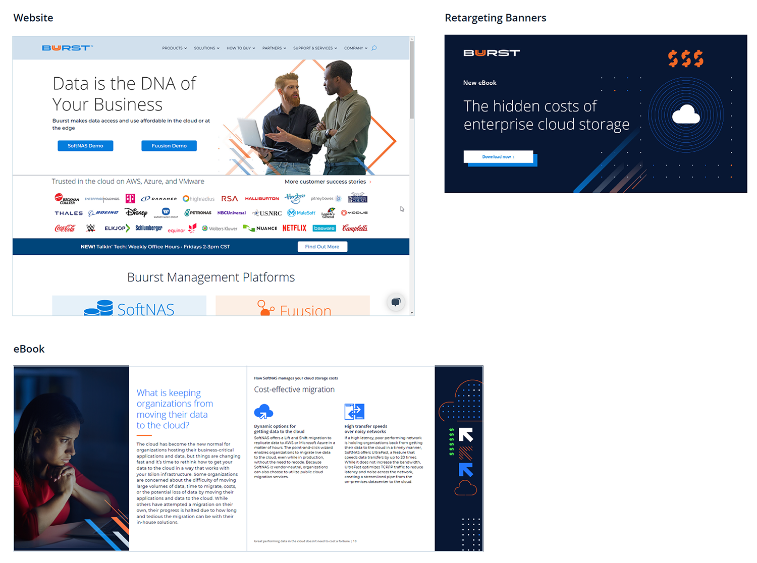
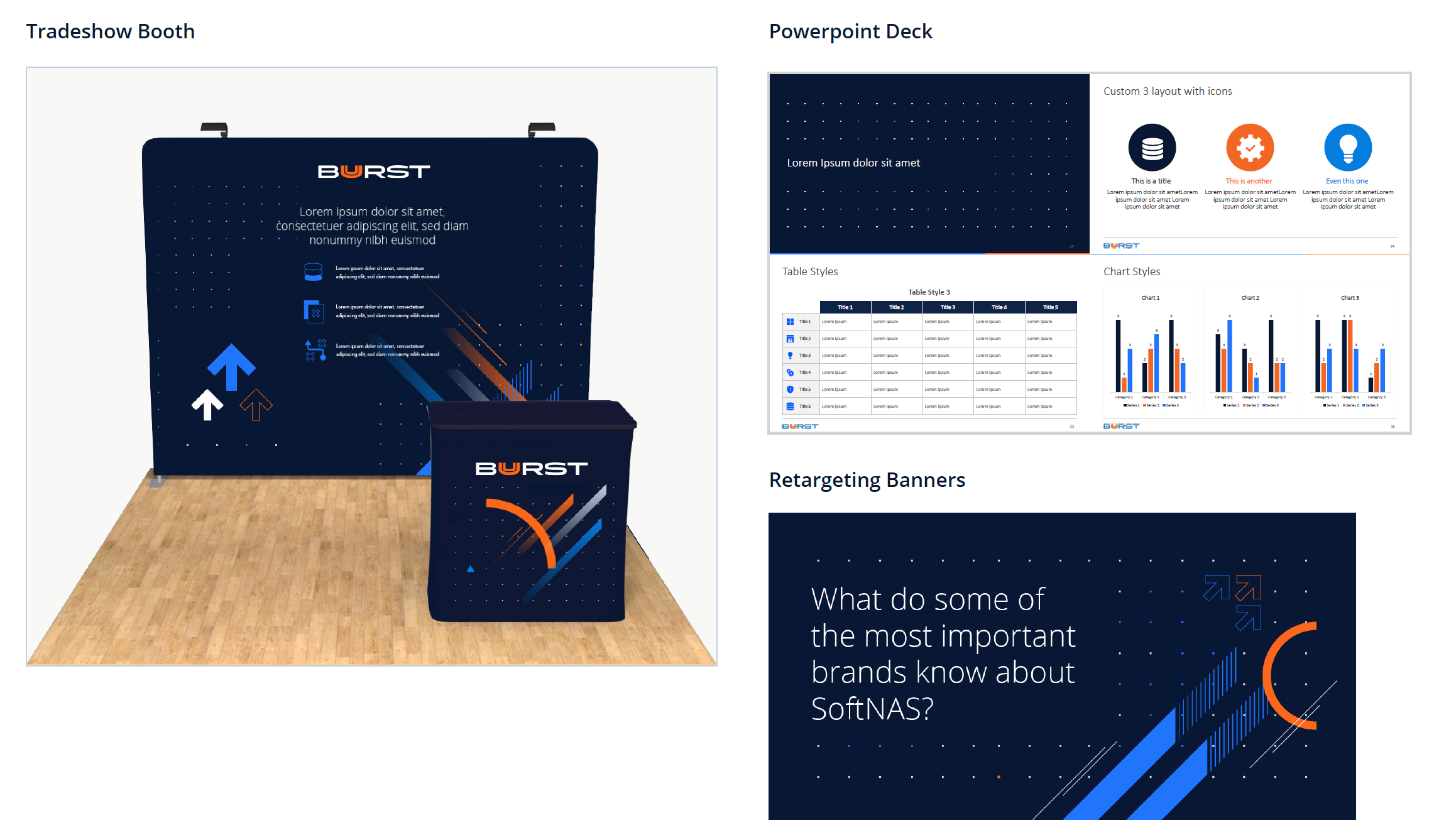
Branding Examples
